Earlier this year, his key role in the Brexit referendum campaign of 2016 was the subject of a TV movie, Brexit: The Uncivil War, in which he was played by Benedict Cumberbatch.
One of the reasons he’s held in high regard is his energetic pursuit of ultra-modern ideas in communications and technology. What he realises, and has been trying to persuade others to understand, is the explosive potential of two things combined: data and communications technology on the one hand, new insights into human behaviour on the other.
A lot of Cummings’s enthusiasms are explored on his own blog. Several pages into this lengthy piece, he makes an excellent point that deserves to be widely spread. He shows the reader a series of pictures of rooms in which decisions are made: a NASA mission control room, the control rooms for power grids, another for the Large Hadron Collider in Geneva. Then he contrasts these with pictures of cabinet rooms in the UK and US.
What’s the difference? What you can see. In purpose-built scientific environments, there are multiple screens, carefully positioned so that as many people as possible can see them. The layout of the seating allows people to see each other too. In the political environments, there are very few screens, if any, and the group is assembled around a long table. It’s not so much low-tech as zero-tech.
It’s not difficult to see the problem. How are the participants in the meeting – the people making a collective decision – able to hold the relevant information in mind? Can they really think together? Probably not. If they’re not sharing information effectively – if they’re not looking at the same facts – how can they work well together? The danger is that instead of collaborating closely people ‘take positions’ and argue for the view that they had before they came to the meeting, rather than using the available data and ideas to develop their thinking in the room.
So if you’re a senior decision-maker, or reporting to one, what should the set-up be? How should data be visualised?
Ideally, according to Cummings, there would be multiple monitors. Data could be called upon as and when required. But on top of that, it would be possible to run different scenarios and models to help predict the impact of different options. It would help people to ask ‘What about…?’ and ‘What if…?’.
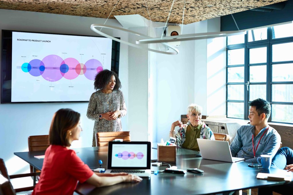
But if it’s you or I presenting to a group, we don’t have ideal tools at our disposal. We can’t spend hours modelling different scenarios with state-of-the-art software to be presented on a battery of wide screens. At best, we get to use a PowerPoint, and we’re lucky if we’re given time to go through it.
But what we can do is be as much like those banks of monitors as possible. Let’s look at the ways it can be done:
Present a range of scenarios
Change one factor on a spreadsheet and the bottom line figure resets automatically. Can you allow your audience to do this in the meeting in some way? Is it possible to present visuals so that variables can be manipulated? If not, can you have a range of versions ready to show if required? Sometimes it’s the sensitivity of the bottom line to one variable that you need to show.
Collect both essential and supplementary content
Rather than struggle to create a definitive version of your slide deck, leave slides ‘hidden’ or ‘skipped’ in the sequence. These are the supplementary ones. They’re there to extend the argument as and when required. If you included all of them, the presentation would be too long and heavy. Normally, your audience won’t see hidden or skipped slides. For how to show them without coming out of the Play mode, see the note at the foot of this blog. It’s one way of giving yourself flexibility. Alternatively, you can send people a different version (with more or fewer slides) of the deck than the one you use in the meeting. You can even print out separate visuals to supplement what goes on the screen if you think it can work.
Try to have an ‘agile’ mindset in the meeting
In other words, see yourself as the bank of screens. Allow the group to switch from one area of your knowledge to another, or ‘toggle’ between you and someone else. Encourage the audience to ask you questions and test the extent of your knowledge – don’t be afraid of exposing the limits of your knowledge. Trying to hide it damages your credibility.
The truth is that so many people go into presentations with the aim of unrolling a single, continuous argument without doubt or deviation. They want their presentation to be self-contained, with no opportunity for the group to pull the argument apart. But it’s only when we’ve pulled something apart that we get to see how it works.
And of course, when we’re in the audience that’s usually what we want: to query things; get fuller explanations: imagine different scenarios; jump to the next bit, etc. Although we might be impressed by a powerful one-way pitch, advocating a fully worked out position, it’s not what we find most helpful in making our own decisions. That’s why we shouldn’t strive for that approach or – and this is a key point – judge others on their ability to do it.
It’s not just about tech. It’s about our whole attitude to information and decision-making. What it means is that, for most of us, our highest utility in the professional environment is to act as a highly flexible, interactive, multi-functional, information-sharing device. Not a recorded message made flesh.
NB How to show hidden/skipped slide without leaving Play mode: In PowerPoint, choose Presenter View from the View menu. This gives you the slide sequence at the bottom of the screen. In Keynote, hit ⌘ key + any number and you get a vertical panel at the side with the sequence of slides.